Thursday, October 25, 2012

Ch 3: Illusion of Space

                                                    Chapter 3: Illusion of Space


        Almost all forms of art are done three-d or want to have the feel or illusion of three-d. We commonly come across the task of putting our design on paper and making it look as if it was really popping out of the paper.

~Foreshortening- Is were in a design the objects seem shorter than they really are.

         Using foreshortening helps you as a artist reach that three-d illusion. By adding some foreshortening it makes your design look as if your looking at it in real live from a one point perspective. For an example if your stand in the middle of a road and look straight down it, you can see it foreshortening. The road never changes size but to your eye it dose. It gives it a three-d look or a never ending look beyond what you can see. Doing this on your designs gives it more than one story than just that simple thing you made.

Foreshortening:

           As you can see in this cover for Uncharted two among thieves. The man seems farther and smaller away, by how he was placed on the design. This gives us the illusion that he is really far away and is really there than just a man on a cover.
              "What Was the Best Game of the Entire Generation?" IGN. IGN Entertainment, July-Aug. 2012. Web.                 <http://www.ign.com/boards/threads/what-was-the-best-game-of-the-entire-generation.452589448/>.

       Don't forget size also plays a big part in the illusion of space or making your design look three-d. Making a object bigger and were you place it all counts. When a object is bigger and closer to the front, you figure that object is really close that's why it's bigger than normal. When a object is placed in the back ground like an orange, you think that orange is far away not that's a tinny orange. This gives you design a more feel fore realism and three-d feel.

~Overlapping- When a object is obscure by other objects or is in front of or behind a object obscuring it.

         Overlapping can give your design that nice touch of three-d and illusion. In real life everything isn't spread out to were it doesn't over lap, so why should your art be? If you draw lets say a soccer ball and a toy fire truck. The soccer ball is closer up and covering half of the fire truck, the fire truck is smaller and only  the back half is seen. This shows that soccer ball is three-d because it's in front of another object. Same goes for the firetruck it's behind another object making it having the illusion of space.
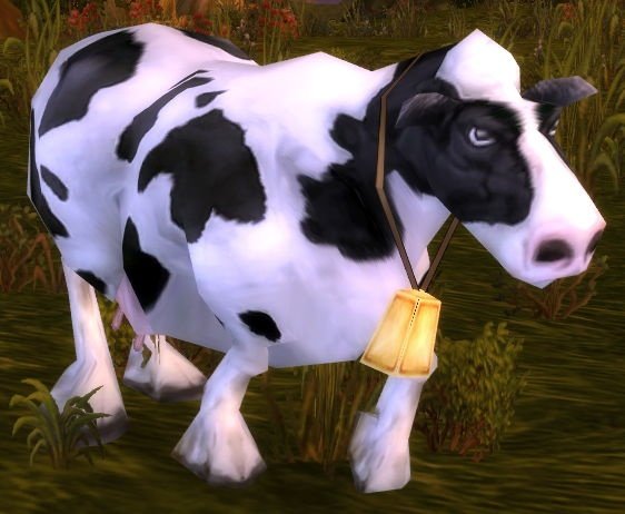
Overlapping:

          As you can see in this picture from world of warcraft. Each building in the back ground is overlapping adding to the illusion of space.
                             "World of Warcraft Screenshots." Game Spy. IGN Entertainment, Inc, 22 Nov. 2004. Web. <http://pc.gamespy.com/dor/objects/16985/world-of-warcraft/images/world-of-warcraft-20080421030035232.html>.

~Vertical location- is when you place a object higher up on your paper, it makes the illusion that it is farther back than it really is.

        That object you place at the top of your design can give it that last little kick for that illusion of space your aiming for. Placing your objects in your design is very useful to making it seem three-d.

~Linear Perspective- Is were all the points in your design meet at a vanishing point on the horizon line.

        Linear Perspective is getting int more of a three-d feel by far. All your objects rest and connect right to the vanishing points that are set on the horizon line. Every angle must match up the the vanishing points they are assigned to, other wise you can mess up your perspective or three-d look of it. While doing this you can keep it one point like we talked about earlier with the road, two point were you see the corner of an object, or  three point perspective when looking up or down at a great height. Don't freak you can have more than a point in your design, you can mix it up with one point and two or even all of them, it's all up to you.

~Open Form- the object is placed so it's cut off by the sides of the picture, making it seem bigger than it really is.

~Closed Form- are the objects that are placed just right too keep your audience attention on the picture.

          Open form adds a since of three-d illusion as well, the object being cut off makes it seem greater than it really is and more full. This illusion will help that object stand out and move away form the background. Closed form is nice to throw in there along with open, it's what's going to hook your audience first and fast.

~Transparency- two objects overlap and you can see one object threw the other, making it seem transparent.

             This is a nice texture to throw in, such as that cloth you have in your design could be transparent. That cloth can have a glimpse of table showing threw it making it seem more like an object and less like a drawing.

Transparency:

       You can see the bears texture is very transparent, letting you see a glimpse of the floor and walls around him. This gives it nice texture and makes the bear really stand out and get your eye.
"Favorite Spirit Beast." WoW Petopia Community. PhpBB, n.d. Web. <http://forums.wow-petopia.com/viewtopic.php?f=15&t=455&start=20>.

Thursday, October 18, 2012

Ch 2: Unity

                                                           Chapter two: Unity


~Unity- The elements in your picture or design look as if they belong together or known as harmony.

     The nice thing about unity is you can have it in representational and non representational. You can all so see unity in designs that look as if they were on a jigsaw, this brings out their  monochromatic. Now you may be asking your self were dose unity and harmony come from? Unity comes from the artist them self's, it's when we design and plan a idea and put it into motion. It reflects how skilled we are as artists and how organized we are or how neat our composition is.When your getting into unity as a growing artist you should look at the bigger parts first then nit pick about the more fine tuned parts. Do not get unity confused with visual unity, they are two different things.

~Visual Unity- Shows you a pattern or arrangement between two more objects that is seen by the eye.

      Why should we freak out about different kinds of unity? As a artist it's our job to make it sure it has plenty of unity and blance to keep it nice and organize. While doing this we are wanting to aim for our design to have some  Gestalt.

      Unity is very simple to achieve there are many ways you can do this. One of the more common ways is to put several objects or patterens that look together in a area, it gives them  proximity. Using repetition shows that our design has patterns that repeat to show the relationship between two different objects in the design. You can see this in color, ambiance, shape, size, volume, shading, line quality, and so forth. The easiest way to achieve unity is continuation, showing that something in the design continues with natural means. You can uses these ways of unity for three-d prespective drawing as well. You might wana use a grid similar to the ones bellow.

               "Illustrator - Plugins." Полная версия. N.p., n.d. Web. <http://www.smk-minds.ru/portal/lofiversion/index.php/t1938-50.html>.
                    "12 by 12 Grid." ClipArt ETC. Florida Center for Instructional Technology., 2004. Web. 2012. <http://etc.usf.edu/clipart/42600/42675/grid_42675.htm>.


~Helpful Tips:

       Remember that unity and variety is made by repeating of gestures, shapes, color, size, pattern, texture, and so on. When your doing a  variety please keep in mind you want it under controlled and not cluttered like the picture below.

                                                                          Cluttered:

       As you can see there is a lot going on in this screen shot, you do want to aim for your designs to look good. Just don't go to crazy with the continuation, repetition and variety.

         "Gyrostarr." Nintendolife. Nlife Ltd., n.d. Web. 2012. <http://www.nintendolife.com/reviews/2008/06/gyrostarr>.

                                                                  Non Cluttered:

        It may not look as pretty as the top design, but it's more clear and easier to fallow with out all the clutter.

 Iwatani, Toru. Pac-Mondrian Video. Namco, n.d. Web. <http://pbfb.ca/rhizome_commission_archive/index.html>.


~Examples:

        In this older picture of mine you can see were I was having continuation in my design and how I kept it uncluttered.

       Name of artwork: Commission, Artwork at: On Facebook, Medium: Photoshop, 10,18,2012 Artist: Kimberly Brown

Name of artwork: Dr,Von. Foxsting, Stine, Artwork at: On Facebook, Medium: Photoshop, 10,18,2012 Artist: Kimberly Brown


Ch 1: Design Process

                                                 Chapter one: Design Process.


         The design process has a couple steps you should fallow to help form your idea and give it shape.

~THINKING:

       You all ready know there is a problem, but how are you going to handle it? You all ready know about the problem so you are all ready working on it. Sadly that's not all you must do. You should stop and ask your self a couple of things, is there a certain style that is needed, color, texture, limitation and when is this solution needed?

       Once you have these question answered and figured out, you then can move on to thinking about the solution. You should sketch down a couple of fast drawings of your problem and how to solve it. Step back and look at your ideas on the paper, what ones fallow this problem and solution?

         Don't forget to think about what kind of audience you'll be targeting. Every little detail and color can easily change who the product or picture is meant for. Last you should double check on how you are going to present it. Once you got these steps down you'll be done with the thinking step. Now you can move on to Looking.

~LOOKING:

     Is were you look at the natural object and how your going to put the likeness of that object in your drawing. Is it going to focus more on one detail or everything?

~DOING:

      When you finally get that idea down on paper and want to add some color or shading to it. During this step you'd test some new ways on approaching the look you wanna get. Once you fallow all these steps you'll be golden.

       In the picture below you can see how a cow looks in the natural world and how an artist portrayed it on paper. See if you can see the steps listed above and how did they do these steps?

                                                                      Natural:
 "Cows." Society for the Advancement of Animal Wellbeing - Protecting Animals and Conserving the Environment. SAAW International, 2007. Web. <http://www.saawinternational.org/cows.htm>.

                                                                        Game Cow:
                                     "Cow." Wowwiki. N.p., n.d. Web. <http://www.wowwiki.com/Cow>.

~Helpful Tips:

   Don't forget that you can easily ask someone to critique what you have done; they might be able to give you a hand or some friendly advice. Don't freak if you can see your pentimenti or were you went over and redid something.